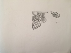
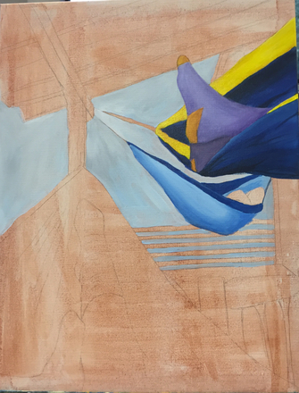
After being presented the prompt for this project, I was very interested to do it. I wanted to keep it natural mostly, with some bits and pieces that were mechanical. I wanted to create something so the mechanical parts would not be obvious, but would be part of the nature. Thus led me to do a cow. Once the idea came, it stuck. The spots on the cow were instead going to be the gears and inner workings of the cow. I started out by drawing the cow. Then I planned out the spots so I could get some interesting mechanical pieces in them. 
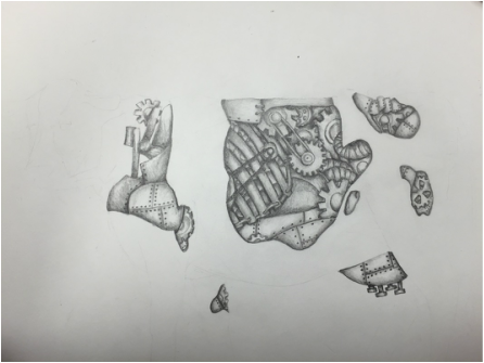
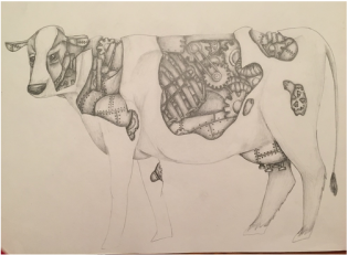
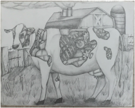
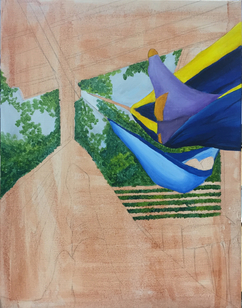
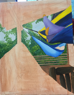
I also like the way I did the skull of the cow. I put less mechanical workings there because I figured too many gears and stuff would cause too much crowding. The hardest part was the grass. I didn't know how to draw the grass, but I tried my best. I don't think it turned out too bad. In the background I wanted to make it farm like, but tie in the mechanical aspect. So I drew a farm house with a smoke pipe so it appears to be a factory. Overall I enjoyed the project and I think it turned out good.
0 Comments
For the interior spaces project, I thought up a lot of ideas. I imagined doing something like a drawer of stuff or something like that. But as a scrolled through my camera roll, I found a picture that I took while I was in the mountains. It was the interior of an eno and the interior of an outdoor deck. For this project, I used acrylic. I didn't run into too many problems. The only part of the painting I was uneasy about painting was the trees. I've never been good at leaves, but I think they turned out good for this project. The two enos on the right were easy to paint because there was less detail and I know there's less focus on them. And the colors were easy because the blue was easy to paint. The wood was difficult to paint because I had to get different shades to show the different colored wood. But after adding some red streaks, I could show the different wood tones. The skin tone was hard, but after painting over it a lot, I feel like I got the right skin tone. I still need to add some shadows under the main feet, but other than that, I think it turned out great. For my oil paint project, I did a painting of a bowl of items in my house. While looking for items to paint, I walked by the bowl and I thought it had good composition, so I took a picture of it. The picture turned out good so I went with it. I started off my canvas with a brown wash, and then I painted the background. Then I started the bowl. After I painted the bowl, I worked my way from left to right with the items in the bowl. My finishing touches were the crystal highlights on the inside of the bowl. Here are my progress pictures and my final piece. I am happy with the way this project turned out. I ended up liking oil paint, it was easier to use than expected. Going into this project, the two things of most concern to me were the bowl and the pine cone. I didn't know how to make the bowl look like glass/crystal since I have never painted glass, but I think it turned out well. And then the pine cone. I have tried pine cones before and they turn out horribly, but as it turns out, the pine cone is my favorite part of the painting.
I found oil paints have some advantages and disadvantages. When using the brushes, it was enjoyable and quite easy. I liked how rich the paint was and how easily I could mix colors. I think my apple turned out well. However, using the palette knives was a whole different story. It was very difficult for me to control the colors and the paint and the shapes I was trying to paint. I am not happy with the way it turned out. But I'm glad I was able to experiment with it. For my reflections project, I drew VW Bus reflections in lightbulbs. I wanted to do something original, and as I was looking around the art room for inspiration, I saw a lightbulb and thought "why not attempt this?". And I chose a VW Bus because I think they're adorable and it's my dream to own one someday. After learning how to do highlights on glass from a tutorial, I started experimenting with lightbulbs. My first drawing of one turned out well. My brother had a fish eye lense, and I have a toy car size VW Bus, so I took pictures from three different angles (so I could show the lightbulbs were reflecting one scene from different views). After that I sketched it out and then colored it in. I chose blue for the background because its a complimentary color of the red in the bus. I was told the bus has somewhat of a tint to it, which was unintentional, but it looks cool anyways. The reason it seems to have a tint is because all the "white" that is on the bus is actually a cream color. I didn't use white because that would've taken away from the highlights in the bus. My favorite bus is the far right one because it looks the most proportional. Overall, I am very happy with my project and I think my prismacolor skills have improved greatly due to this project. I probably wouldn't change a thing I did.
|
About MeI enjoy art Archives
May 2016
Categories |