For Heartbreak Hotel, I did a street sign pointing towards a hotel looking building that I found somewhere in Raleigh. I chose watercolor because I thought it would be an easy piece to do it with because it didn't require a lot detail since the hotel was in the background.
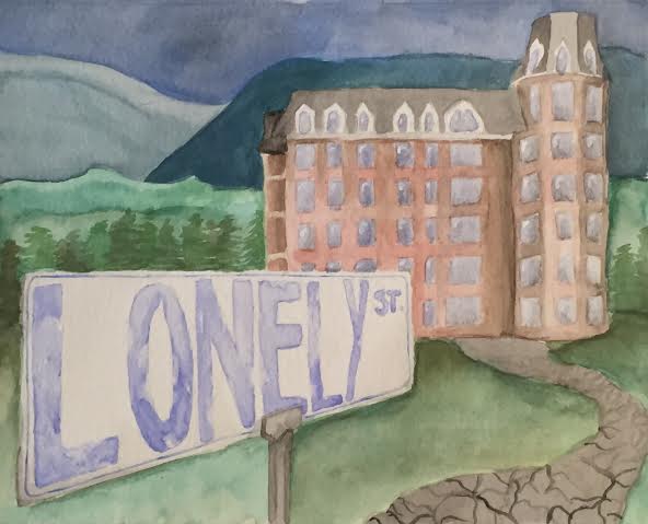
I really like how the colors turned out. I didn't plan on keeping the colors kind of dull and faded, but I am glad they ended up like that. I think it adds to the ambiance of the song which is sorrow and stuff. I think the way the street sign has a perspective towards the building, it really draws your eye from the left side of the painting towards the building. I tried to make the street sign look old and kind of falling apart, and I don't know if I accomplished that too well, but I still really like the way it turned out. I think by putting blue in the mountains in the back carries the blue in the street sign through the whole piece and keeps a solemn mood to the piece. Also, it helped prevent my piece from looking too green.
 RSS Feed
